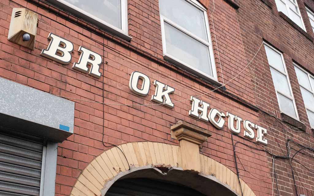
What is that font? You know, THAT font? The chunky italic lettering you see on launderettes and council blocks, on post-war churches and new town butcher’s shops, across the UK.
The font you’re thinking of might well be ‘Festive’, a lettering style designed by Maurice Ward of Ward & Co, a sign-making company in Bristol, founded in 1952.
Launched in the early 1960s, Ward’s ‘Inter-signs’ product, manufactured under the Lettercast brand, used injection moulding.
Lettersigns was available in two styles, Festive and Block, and made it possible for anyone to mount their own custom signs with professional-looking 3D lettering.
Or, of course, the specific sign you’re thinking of might be in one of any number of similar lettering styles in the broader category of ‘Egyptian italic’.
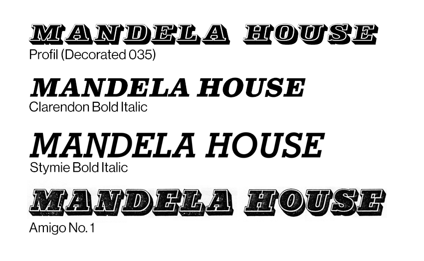
Those include:
- Egyptian Italic (an earlier Ward & Co style)
- Festival Egyptian (an official style of the Festival of Britain)
- Stymie Bold Italic
- Clarendon Bold Italic
- Profil
- Amigo No. 1
First, then, let’s pin down how to spot Festive in particular.
How to spot Festive
Trade catalogues from Wards of Bristol include samples of Festive in print.
From this, we can see the most distinctive features of Festive, which can help us distinguish it from similar lettering styles in the wild.

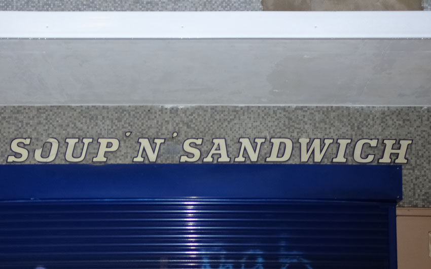
First, there’s the unexpected serif at the apex of the capital A.
Then there’s the relative flatness of the round letters, like C and G.
And, of course, there’s the built-in beading – that outer line that traces the edge of each letter.
The origins of Festive
There’s a clue right there in the name: like almost every bit of flair in Britain’s mid-20th century public spaces, it came indirectly from the 1951 Festival of Britain.
One of its official lettering styles was ‘Festival Egyptian’, as depicted in the typographic handbook for designers.
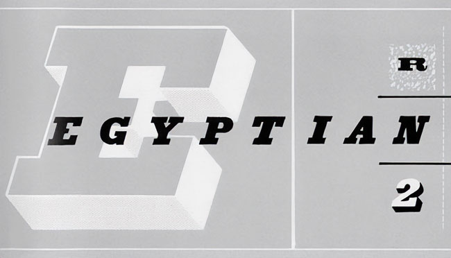
But why Egyptian? In around 1817, London type founder Vincent Figgins created a typeface he referred to as ‘Antique’.
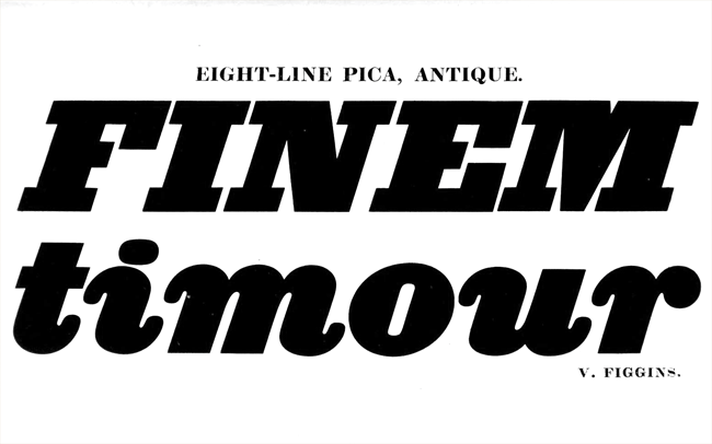
It was fat, bold and easy to read from a distance.
Earlier examples of this style have been found but Figgins commercialised it and prompted imitations from other foundries worldwide.
These days, they’re known as slab serif fonts but in the 19th century, they were usually referred to as antique, after Figgins; or as either Ionic or Egyptian, in variations on the theme.
You can certainly see in Antique, especially when italicised, the seeds of the 20th century launderette signs and tower block titling.
But these in-your-face, ungainly display typefaces went out of fashion, like everything associated with the Victorians. They spoke of slums, music halls and Gothic mausoleums. They weren’t fit for the world of motor cars, aeroplanes and Streamline Moderne.
Then, in the 1930s, a revival began, achieving its full flowering with the 1951 Festival of Britain. This is documented in detail by Paul Rennie in this 2001 essay (PDF) but here are the key points.
First, the cover of John Betjeman’s first book Ghastly Good Taste, published in 1933 when he was still in his twenties, showcased a jumble of Victorian typefaces.
Then, in 1938, came Nicolette Gray’s book Nineteenth Century Ornamented Typefaces, celebrating Victorian lettering styles.
And in the same year, the architect and townscape designer Gordon Cullen personally produced (non-italic) slab serif lettering for the starkly modern Finsbury Health Centre. It is clearly ahead of its time and wouldn’t look out of place on a municipal building erected 20 years later.

Though the British Government generally clung to clean, uncluttered sans serif typefaces such as Gill Sans for official posters (Keep Calm and Carry On, chaps) advertising designers and publishers dabbled in Victorian styles throughout the 1940s.
After World War II, In the run up to the Festival, committees and working groups were put together to consider every small detail, including typography. Gordon Cullen and Nicolette Gray were both on the Festival of Britain Typographic Panel.
Once the Festival was over, Festival style lingered. Lettering catalogues from the 1950s and 60s include, for example, Egyptian Italic, Rockwell Italic and Ultra Bodoni Italic.
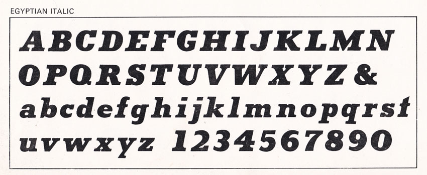
Maurice Ward wrote this of his Egyptian Italic, the immediate precursor to Festive, in a catalogue from 1962:
[This] face, together with its vertical counterpart is a harmonious combination of the best features of the Egyptian family of characters and is perfectly suited as an architectural letter on buildings. The popularity of these Egyptians is unquestionably due to the Festival of Britain in 1951 and no face characterises more aptly the word ‘Festive’.
And when Ward & Co (Lettercast) launched Festive in around 1963 it was labelled as “based on Egyptian Italic”, which was in turn a take on Festival Egyptian.

Feelings about fonts
What’s fascinating about Festive is how it moves people emotionally, and obsesses them.
The writer Jason Hazeley has been trying to identify it for years, for example, referring to it as “That Font” or “Everywhere Bold Italic”.
And he is not alone. For a generation of British people, it represents the vanishing landscape of their childhoods, tied into ideas of nostalgia and even hauntology.
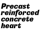
Graphic designers have often resorted to Profil as a close match – and, of course, Festive was never really intended to be used in print.
On social media, including a popular Flickr group, Stymie Bold Italic has incorrectly been used to describe this entire category of lettering styles.
It’s only recently, however, that illustrator and designer Richard Littler of Scarfolk fame managed to unlock the mystery – or, at least, bring together all the threads.
When he put out a call on social media his significant reach across multiple platforms, with exactly the right kind of people, brought to light:
- previously overlooked material at archive.org
- detailed research into the British soap opera Crossroads (Wayback Machine)
The latter, a spectacular piece of work, has been sitting there for anyone to find since 2020, in a different domain of geekiness – if only type nerds had known to search ‘Inter-signs’ and ‘Lettercast’.
Personally, I’m a bit embarrassed not to have got there sooner. Back in 2020 I spent some time researching this seriously. I got in touch with Andy Ward, Maurice Ward’s son, who tipped me off to Egyptian Italic, and sent me photocopies of material he had at hand, at home, during lockdown.
And then Christine Daniel sent me photos of the back of some sign letters in her collection with ‘Inter-signs’ clearly marked on the back. But I couldn’t quite make those final links.

Together, though, we got there. The mystery has been solved. What a relief.
With thanks to Christine Daniel, Jason Hazeley, Richard Littler, Paul Rhodes and Andy Ward.
4 replies on “That mysterious font is Festive, not Stymie”
[…] Festive […]
LikeLike
Where/How can I download this font? The term “Festive” leads to all kinds of Christmassy fonts.
LikeLike
You can’t, unfortunately. There is, as far as I know, no digital version, although I’ve just made a very rough one for my own use. For something very similar search Decorated 035, or Profil.
LikeLike
[…] I doubt it will ever be listed, even if it does have some of the most wonderful original signs in the Festive font. But whenever I cut through it, I look at the little square chimneys perched on the bungalows, and […]
LikeLike